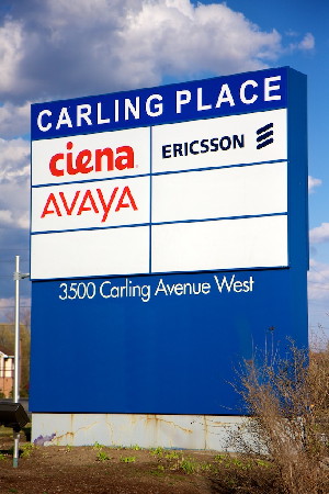
There is a new sign at the Carling Campus, which was installed last week. It replaces the old Nortel signage, which is understandable due to the divestiture.

But the sign is really hideous. The former Nortel Carling Campus is a beautiful location, with interesting architecture, surrounded by forests with wonderful walking paths. I like working at this location because of all of these reasons.
First, I don’t like the name. It’s too similar to “Carleton Place”, the town just outside of Ottawa. It is a non-descript, meaningless name. The name could have been more apt, like “Carling Campus”, which sounds like a place of higher learning. Or perhaps “Technology Park”, which echos places like RTP and includes the nature around the campus, even if the actual name is a little boring.
And finally, the font. I can’t believe the height of design for the sign was an Arial font. Arial is the most boring font in the world. It is completely without character (no pun intended). It is the font of last resort when there are no other fonts available. It is classless and boring to look at. A 6-year old could have designed the sign. I could have designed the sign better than what we got. Instead of spending $100 to hire some Algonquin College Graphic Arts student to do a nice sign (and support the local schools, which is a good news story for the papers), someone decided it was more important to give hundreds of millions of dollars on executive bonuses.
I am so incredibly disappointed in what Nortel will come to represent in the future. It’s a horrible misrepresentation of Nortel that more people will remember the bonuses to executives instead of to pensioners than for the technology that made the company as important as it was a decade ago.
